Welcome

You are about to enter... the graphic design zone!

Monday, April 25, 2011

Signature Sheet

Here's the signature sheet for the memory book. I decided to create it in Photoshop because I didn't want any elaborate designs but I wanted to be able to add effects to the pictures and things like that. I started out with a solid dark brown background, then I added images of wood texture, crumpled paper, and cardboard, set them on overlay, and reduced their opacity to add some texture to the background. Then, I added a picture of the old paper, resized it, and rotated it. Next, I added the text that says "Signatures" and used some brushes with the eraser tool to make it look worn. Next, I selected the top roll of the paper and copied it to a new layer above the text layer so it looked like the text was underneath the roll. Then, I added a drop shadow to the roll and to the entire sheet of paper.Then, I used the burn tool to burn the bottom left piece of the paper. Finally, I added a gradient (from white to gray to black) from the top left to the bottom right, put it right below the piece of paper's layer, changed it to overlay, and reduced the opacity. I think that's everything there is to it, so I hope you enjoy!

Friday, April 22, 2011

Curl

Okay, here's the curl effect. There's not much to explain on this one because it was so simple; in fact, I never realized how easy it is to create this kind of effect. Anyway, I pretty much just followed the tutorial and then added a solid color layer below the picture to make it look nice and easier to see. Hope you enjoy!

Sticky Tape

Here's the sticky tape tutorial. This was pretty easy, I just followed the tutorial. I had to download some grunge brushes from a site I found on Google because the link they had for the grunge brushes didn't seem to have any way to download them. Otherwise, I just followed the tutorial and used a picture that I found. Lastly, I added a canvas texture to the picture to make it look older and more worn.

Thursday, April 21, 2011

Project - Achievement: Class of 2014

Here's my photo collage clipping mask thing for the project achievement. It wasn't too difficult. First, I got a bunch of pictures and then turned them into Polaroids. It was A LOT EASIER to make all of the photos into Polaroids when I used the action that I downloaded. I like getting to just push a button and have Photoshop make the Polaroid effect for me instead of having to do each step individually on every picture. Anyway, after that, it was pretty simple. I created an 8 1/2" x 11" landscape document in Photoshop with a 300 ppi resolution, and then I had to change the resolution to 300 ppi on all of the photos so they wouldn't look blurry when I put them on the document. Then, I just copied all the photos into the document, made them all the same size and smaller, and arranged them on the page. Next, I added "Class of 2014" and "2010-2011" in a font that I liked that was also thick enough that you'd be able to see the photos. Then, I clipped the photo on the text, added a drop shadow and a bevel, and then added the word "YEAR" on the hyphen between "2010" and "2011." Anyway, that's about it. Hope you enjoy!

Wednesday, March 23, 2011

Text Carved in Bark


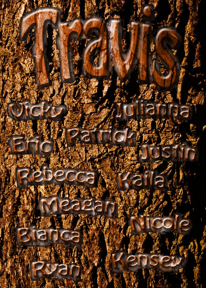
Here's the text carved in bark tutorial. This one was pretty easy and I think it looks really cool. I just followed the tutorial for this one, so there's not much to write about. I used my own pictures of bark and wood grain, and added my name and my friends' names instead of what they have. Since I had my own pictures of bark and grain (which were slightly different than the ones in the tutorial) I had to change the blending mode on the text to overlay instead of color burn, because if I did color burn the text was really dark for some reason. Anyway, I think that's everything.

Tuesday, March 8, 2011

Illustration Clipping Mask

Here's the source image I used for the illustration clipping mask... just a simple mountain scene. It took me awhile to find this picture... it's amazing how many pictures of mountains are blocked (although I don't know why!).


 And here's the final image I have after I did the illustration clipping mask. I used a custom shape of a bird to make this. Once again, it was pretty quick and easy and there's not much to explain. I just followed the steps from the tutorial and then at the end I cropped it to get just the part I wanted and then I added a green background. Finally, I added the drop shadow. Hope you enjoy!

Text Clipping Mask

Here's the source image I used for the text clipping mask. Not much to explain; it's pretty simple... and it's making me hungry! :P
And here's the final image after I did the text clipping mask. It was really easy. I just followed the steps and then added the drop shadow and stroke on the text. Finally, I added the dark red, "cherry" color in the background to contrast the brown chocolate and make it stand out more and make it easier to read. This was pretty simple. Anyway, hope you enjoy!

Monday, March 7, 2011

Project - Achievement, Part 1


Okay, here's the first part of the collage we had to do. I used various pictures and used the vintage Polaroid effect on them like in the tutorial, so there's not much to explain about that. I used the same background as in the vintage Polaroid tutorial, but I made a layer on top of the background called "circles" and I set the blending mode to "Overlay." Then, I drew random white and gray circles on the layer to create darker and lighter circles on the background to make it look cool. The silhouette was pretty simple, too; I just made my selection from the picture, moved it over to the collage, and filled it with black. Then I gave it a white outer glow. To make the stroke, I just followed the same steps as in the design pattern tutorial, so, once again, not much to explain there either. Next, I added a layer below the background with a blue radial gradient in the lower right corner; then, I added a layer mask to the background and used a soft black brush to make it fade into the blue layer. Next, I added the word "Memories" and converted the text into a shape. After that, I followed the same steps as in the design pattern tutorial to make it spiral around in the corner. Finally, I added the "Remembering 2010-2011" in blue at the top and gave it an outer glow. Hope you enjoy!

Friday, February 25, 2011

Design Pattern

Here's the design pattern thing we had to do. I chose to make the pattern with a coke bottle. There's not much to explain for this one. I just followed the tutorial using a Coke bottle instead of a guitar, and I added a yellow hue instead of a blue one. Also, I used my silhouette instead of the one they used. Once I got all the basic stuff done, I added the "Drink Coca-Cola" text with a cursive/handwriting looking font to sort of match the Coca-Cola logo font. Then, I added an outer glow to the main Coke bottle, duplicated the main Coke bottle, and made that layer's outer glow have some noise to make it look cool. Then, to make a reflection, I duplicated the large Coke bottle and removed the outer glow effect; then, I flipped the bottle, moved it below the main one, added a layer mask, and used the gradient tool on the layer mask to make the reflection fade out. I did not lower the opacity because I think it already looks subtle enough. To add the stroke, I just followed the steps Ms. Klein gave us. I used the pen tool to create a path, used the stroke path with my choice of brush and color, and then added an outer glow to the stroke to make it more vivid. Next, I added a small Gaussian blur to the black box at the bottom to make it look nicer. Then, I added the ".refreshing" at the bottom in a more modern, "refreshing" looking font to make it look cool. Anyway, hope you enjoy. 

Wednesday, February 23, 2011

Movie Poster

 Okay, here's the power ball movie poster. This wasn't too difficult to make. I just followed the steps on the tutorial. I couldn't get my power ball to look exactly like theirs, but I guess that's okay because mine still looks cool. It took me awhile to find a good picture of Mordor that wasn't blurry or tiny. I used a Will Ferrell as my celebrity; I just cut him out of another picture with the magnetic lasso tool and made any corrections with the lasso tool. I used the dragons from the website they provided and cut them out and put them in the background. I adjusted the Hue/Saturation for all of them to make them more red-colored so they would match the overall feeling. Then I added the catchphrase at the top. Finally, for the logo, I used the logo from "How To Train Your Dragon" but I cut out the work "Train." First, I had to get rid of all the white background from the logo. Then I used the rectangular marquee tool to cut out the word "Train." Next, I added my own text that says "Kill." I found the typeface that looks most similar to the one they used. Then, I adjusted the kerning and other settings so it would match the best. After that, I used the eyedropper tool to select a color from the logo and then I changed the word "Kill" to that color. Next, I added a slight blur to the word "Kill" so it would blend in better. Then I merged the logo and my text into one layer and increased the saturation so it would be extra red. Finally, I added the text "Will Ferrell knows..." and changed the color to the same red. Then I added a lens flare to make it look cool. Anyway, I think that's everything; hope you enjoy!

Wednesday, February 16, 2011

Vintage Polaroid

Okay, here's the vintage Polaroid. This was also pretty easy. I just followed the steps in the tutorial. I had to find my own images for the background textures because the website they used was blocked. To get the image of the tractor, I just copied the one they had on their website and then cropped the border. Then I just followed the steps. At the end I added the text below the image. I chose a font that looked like handwriting, rotated it to fit on the bottom of the picture, and then converted it to a smart object. I added a layer mask and then used a black brush to add some of the grunge effect. Finally, I used an adjustments layer to lighten the text and make it look older. Hope you enjoy!

Retro Poster

Okay, here's my Vintage Pop Art/Retro Poster. This thing took a LONG time... it wasn't very difficult, just time consuming. I used the same picture as my iPod silhouette for me and then I got a picture of some weird bird for my head. Otherwise, I pretty much just followed the steps of the tutorial. Below are the source images I used. Anyway, hope you enjoy! 

This is the old paper I used as the background..
 This is the bird head I used.
 These are the words around me. I just cut them out with the lasso tool.


 The above three pictures are the old papers that had the letters of my name on them.

 The above two pictures are the patterns I used for the blobs behind me.

Wednesday, February 9, 2011

Makeover Yourself


Okay, the first one is the before photo, the second one is the after photo, and the third one has all the corrections I made; here they are:

1. Changed color of shirt (selected shirt, changed color to red, set blending mode to color)

2. Removed tooth that was showing (healing brush tool)

3. Changed eye color (Selected eye color, Image > Adjustments, Hue/Saturation)

4. Whitened eyes (Selected white of eyes, Ctrl + J to new layer, blending mode to screen, adjusted opacity)

5. Fixed left eye (Used clone stamp tool, set to flip horizontal, and copied right eye so both eyes would be the same)

6. Lightened hair color (Selected hair, went to Image > Adjustments > Brightness/Contrast and adjusted the brightness to make my hair lighter. Then, I added a Gausian blur so the effect would blend in.)

7. Added strand of hair (Clone stamp tool)

8. Removed wrinkles under eyes (Healing Brush Tool)


Wednesday, February 2, 2011

Digital Makeovers: Skin Tone Correction

Okay, here's the original image I used for the tutorial. I just copied it from the website. It was kind of annoying because the pictures kept changing, but eventually I was able to copy the original picture.

 And here's the final image after I did the tutorial. This tutorial was also very simple. You just had to select an area, make a new layer, choose a skin tone, then fill the selection with the skin tone color and set the blend mode to color. Finally, you could adjust the opacity of it to make it look better. I think it looks pretty good and it worked well for getting rid of the bright highlight on the skin. Anyway, hope you enjoy!

Tuesday, February 1, 2011

Digital Makeovers: Wrinkle Removal

Okay, here's the original image that I started out with for the wrinkle removal tutorial. I just copied it from the website.

 And here's the final image after I removed all the wrinkles with the healing brush tool using the tutorial. It was pretty easy. All I had to do was select a source and then use the brush to cover up all the wrinkles. Not much to it. Anyway, hope you enjoy!

Digital Makeovers: Whiten Teeth

Okay, here's the original image I used for the whiten teeth tutorial. It's really small because it's the only picture I could find that they used that was unchanged. Anyway, you can still see the difference between this one and the final picture.

 Here's the final image after the teeth and eye whitening. I used the dodge tool method because the image was so small I could not make a selection of the teeth to do the other 2 methods. Anyway, the dodge tool seems to be good at whitening and things like that. Hope you enjoy!

Digital Makeovers: Eye Makeup

Here's the original image I used for the eye makeup tutorial. I just copied it from the website.

 Here's the final product after I did the tutorial. It was really easy. I just followed the steps on the tutorial.... I'm not really sure what eyeliner is so I don't know if I did the last step right. Anyway, hope you enjoy!

Monday, January 31, 2011

Digital Makeovers: Change Hair Color

Okay, here's the original picture I used. I just copied it from the website.

 And here's the final image. The tutorial was pretty simple and easy. Just use the brush in quick mask mode to select what you want, turn of quick mask mode, select the inverse to just select the hair, then adjust the hue and saturation to change the color. It's not perfect, but I didn't want to spend the whole period just trying to get a perfect selection of her hair, but I guess if you had time you could make it look really realistic. Anyway, hope you enjoy!

Digital Makeovers: Move Nose

Okay, here's the original image I used. I just copied it from the tutorial and cropped out the border.

 And here's the final image after I did the tutorial. It was really easy; it only took a couple of minutes. I just followed the steps and that was it. Anyway, hope you enjoy!

Clone Stamp Tool

Okay, here's the original image for the clone stamp tool tutorial. I just used the image they had on the tutorial.

 And here's the final image after the cloning. This was pretty simple and straightforward. I just used the clone stamp tool to make copies of the original squirrel, and I changed some of the settings to flip the clones. Not much to it. Hope you enjoy!

Friday, January 28, 2011

Spot Healing Brush Tool

Okay, here's the original image I used for the spot healing brush. I just found it on Google.

Here's the final image I have after using the spot healing brush. It looks much better. The tool was really easy to use, and it was really fast. Anyway, hope you enjoy!

Content-Aware Fill with Panorama

Here's the original image I used for the panorama. I just copied the image from the website and cropped it to get rid of the window around it.

 Here's the final image I got after using content-aware fill. Basically what I did is copied the background image that I had, traced just the photo part and not the background, and pressed Ctrl + J to copy that selection of just the photo. Then I deleted the copy of the background. Next, I selected the inverse of the selection to have just the background. Finally, I did the content-aware fill option to fill the blank space. It was really easy. I think there's just a white line because I had to manually select the picture, whereas in the tutorial they already had a selection. Anyway, hope you enjoy!

Content-Aware Fill

Okay, here is the original image that I used for this tutorial. I just copied it from the website and cropped it to get rid of the window around it.

And here's the final product. This was actually really easy, and I was surprised at how well it worked. All you have to do is make the selection and use the content-aware fill option. Anyway, I hope you enjoy!

Thursday, January 27, 2011

Advanced Masking for the Hair Thing

Okay, here's the advanced masking for the hair thing. It didn't seem much different than the basic, but whatever. It wasn't too difficult, it's just hard to get all of the hair to show up without making the background appear, too. Following are the original images I used. Anyway, hope you enjoy!

 Here's the background image I used.
 Here's the original image I used. I just selected it using the quick selection tool and the lasso tool. Anyway, I think that's everything.

Basic Masking for the Hair Thing


Okay, here's the thing I did for the Basic Masking video. It was pretty easy. I just got a picture from the internet, followed the instructions, and then put the picture on a new background. To me, it looks like she's sassing the moon... but that's just my opinion. Following are the original pictures I used. Anyway, hope you enjoy!

 Here's the original image I used. I just traced it using the quick selection tool and then just followed the video.


Here's the picture I used as the background. I didn't really have to do anything with this. Well, I guess that's everything...