Welcome

You are about to enter... the graphic design zone!

Wednesday, March 23, 2011

Text Carved in Bark


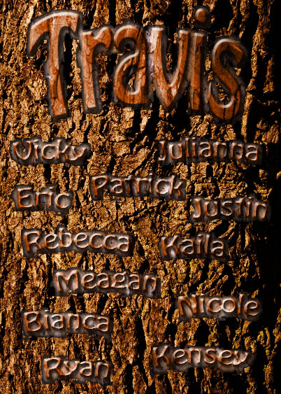
Here's the text carved in bark tutorial. This one was pretty easy and I think it looks really cool. I just followed the tutorial for this one, so there's not much to write about. I used my own pictures of bark and wood grain, and added my name and my friends' names instead of what they have. Since I had my own pictures of bark and grain (which were slightly different than the ones in the tutorial) I had to change the blending mode on the text to overlay instead of color burn, because if I did color burn the text was really dark for some reason. Anyway, I think that's everything.

Tuesday, March 8, 2011

Illustration Clipping Mask

Here's the source image I used for the illustration clipping mask... just a simple mountain scene. It took me awhile to find this picture... it's amazing how many pictures of mountains are blocked (although I don't know why!).


 And here's the final image I have after I did the illustration clipping mask. I used a custom shape of a bird to make this. Once again, it was pretty quick and easy and there's not much to explain. I just followed the steps from the tutorial and then at the end I cropped it to get just the part I wanted and then I added a green background. Finally, I added the drop shadow. Hope you enjoy!

Text Clipping Mask

Here's the source image I used for the text clipping mask. Not much to explain; it's pretty simple... and it's making me hungry! :P
And here's the final image after I did the text clipping mask. It was really easy. I just followed the steps and then added the drop shadow and stroke on the text. Finally, I added the dark red, "cherry" color in the background to contrast the brown chocolate and make it stand out more and make it easier to read. This was pretty simple. Anyway, hope you enjoy!

Monday, March 7, 2011

Project - Achievement, Part 1


Okay, here's the first part of the collage we had to do. I used various pictures and used the vintage Polaroid effect on them like in the tutorial, so there's not much to explain about that. I used the same background as in the vintage Polaroid tutorial, but I made a layer on top of the background called "circles" and I set the blending mode to "Overlay." Then, I drew random white and gray circles on the layer to create darker and lighter circles on the background to make it look cool. The silhouette was pretty simple, too; I just made my selection from the picture, moved it over to the collage, and filled it with black. Then I gave it a white outer glow. To make the stroke, I just followed the same steps as in the design pattern tutorial, so, once again, not much to explain there either. Next, I added a layer below the background with a blue radial gradient in the lower right corner; then, I added a layer mask to the background and used a soft black brush to make it fade into the blue layer. Next, I added the word "Memories" and converted the text into a shape. After that, I followed the same steps as in the design pattern tutorial to make it spiral around in the corner. Finally, I added the "Remembering 2010-2011" in blue at the top and gave it an outer glow. Hope you enjoy!