Welcome

You are about to enter... the graphic design zone!
Showing posts with label text. Show all posts

Wednesday, March 23, 2011

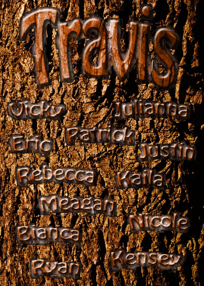
Text Carved in Bark


Here's the text carved in bark tutorial. This one was pretty easy and I think it looks really cool. I just followed the tutorial for this one, so there's not much to write about. I used my own pictures of bark and wood grain, and added my name and my friends' names instead of what they have. Since I had my own pictures of bark and grain (which were slightly different than the ones in the tutorial) I had to change the blending mode on the text to overlay instead of color burn, because if I did color burn the text was really dark for some reason. Anyway, I think that's everything.

Tuesday, March 8, 2011

Text Clipping Mask

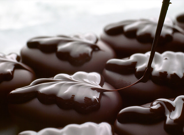
Here's the source image I used for the text clipping mask. Not much to explain; it's pretty simple... and it's making me hungry! :P
And here's the final image after I did the text clipping mask. It was really easy. I just followed the steps and then added the drop shadow and stroke on the text. Finally, I added the dark red, "cherry" color in the background to contrast the brown chocolate and make it stand out more and make it easier to read. This was pretty simple. Anyway, hope you enjoy!

Monday, September 27, 2010

SPLAT!

Here's my splat text thing. It was pretty fun to make, but the letter "P" was being really annoying; the 3D effect on it got messed up somehow so I had to erase it and make a new letter "P".... and yes, I know the shadows look really bad; they're really hard to make. Anyway, I hope you enjoy it!

Thursday, September 23, 2010

Quote... 2.0!

I wasn't really sure what to change for the revision of the quote. I left the words "afraid" red with a black outline and a different font to make it look scary. I left "heights" vertical and in a thin, blue font to make it look tall and remind you of heights. I changed the word "me" from brown to purple because I think the author of this quote is trying to make himself look good by saying he's not afraid of heights... and for some reason that just reminded me of royalty and purple. I also changed the words "widths" to a lighter, olive-colored green because olive green symbolizes peace; I think this makes it ironic because the author is saying he's afraid of widths, but widths aren't very scary, so I put it in a color that evokes the feeling of peace. I also outline the author's name in the background with a darker colored gray to give it more emphasis and to make it easier to read. Anyway, here's quote 2.0!

Wednesday, September 22, 2010

Spiral Type

Here's my spiral type thing. I guess this is all we had to do... it was pretty easy. I just wrote random stuff on it, but the font is really small... I guess I wrote too much. I made a copy to put in the center of the spiral, but you can't read it. I made the picture X-Large since the font is so small. Anyway, there it is.

Monday, September 13, 2010

Glyph Monster

This is my glyph monster. I based him off of the jester picture. To make him, I first made the base structure of him using all the shapes and symbols so that he looked similar to the picture. Then I added shapes all around him and changed some shapes so that he looked abstract. I tried to use as many small shapes as possible so that the picture looked sort of hectic and exciting. I chose green as the background because I think green is more of a happy color, and jesters are happy.

Thursday, September 9, 2010

Quote

I chose to make the word "afraid" red, outlined and black, and larger than the rest of the words because I felt it was an important word in this quote, and red is a very exciting color.  I made "heights" blue and vertical because it makes you think of heights, and the blue reminds me of the sky, which goes on forever and makes me think of heights.  I made me larger than the rest of the words and a different color to grab people's attention because I feel it is an important word because the author is trying to make it clear that he isn't afraid of heights.  And finally, I made the word "widths" green and very wide.  It makes me think of a wide field of grass because it is green. I think the way I laid out the quote is asymmetrical because there is a lot of open space in the middle and there is nothing on the left side. I think it has a linear rhythm because there are a lot of straight lines to represent "heights" and "widths." I tried to put a lot of emphasis on the words "afraid", "heights", "me", and "widths." I tried to align things so that it portrayed "heights" and "widths" well, and I left lots of open space in the middle so I could position the author's name so that it is in the background but still very visible.