
Showing posts with label design. Show all posts
Showing posts with label design. Show all posts
Friday, February 25, 2011
Design Pattern
Wednesday, October 27, 2010
Personal Expression

Thursday, September 2, 2010
Elements of Design
Direction
 |
This picture of a car has a lot of diagonal lines that represent movement and action, parallel lines that gives it a feeling of speed, and curved lines that give it a graceful look. The direction of the lines also gives the image a perspective. This picture creates an emphasis on the car; the company wants you to focus on the car because they are trying to sell it. Line and Color 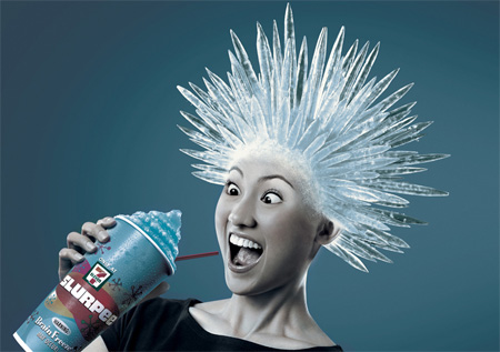 Texture I think that this picture of seashells has a rough texture. The ridges on all the seashells makes it feel rough but also orderly because the ridges are spaced very evenly. There are lots of broken fragments of seashells which adds to the rough and jagged feel of the image. The sand scattered over the seashells also adds a gritty texture to the picture because of how sand looks and feels. I think this image has a rhythm of repetition. It uses the seashells over and over and over again to create a patter, creating a sort of uniform look. Shape  Size  Value  |

Subscribe to:
Comments (Atom)